Category: Luxury & Specialty Packaging

The Art of the Great “Unboxing” Experience

The rise of influencer marketing has led to another social media phenomenon – the “Unboxing Experience.” The definition of Unboxing is the act of documenting oneself, mostly on video, of opening a packaged product from a box and displaying, reviewing, and showing off its contents. The unboxing experience has become almost as exciting as what’s inside the box. Consider these stats:

  • Over 90,000 people type “unboxing” into YouTube every month
  • Search for “unboxing” on Instagram and approximately 3,776,111 posts come up
  • There are almost 40 unboxing videos with over 10 million views
  • 42.2% of customers find reviews to be helpful types of influencer content, with 13% looking to unboxing videos versus just 6.1% being influenced by images or videos of a product
  • 62% of marketers measure the success of their videos by the engagement they get

Elements of Delivering a Great Unboxing Experience

Unboxing videos by influencers and consumers have helped brands build brand loyalty, generate excitement and go viral. Unboxing is about generating enthusiasm beginning to end, telling your story, building excitement around it and getting others to shout it out loud. We are obviously suckers for great packaging, and we truly believe you can’t deliver an unforgettable unboxing experience without great packaging. They kind of go hand in hand. Companies like Apple, Sephora, Sony, Google and Birchbox know this. So what makes great packaging in our opinion? Here are some of our thoughts.

A Good First Impression

First impressions are everything, especially when it comes to unboxing. Make sure the colors, gradients, paper texture and the design on the outside scream “open me!” Branding on the outside also goes a long way in delivering a memorable experience from start to finish, not to mention it makes the entire packaging feel custom.
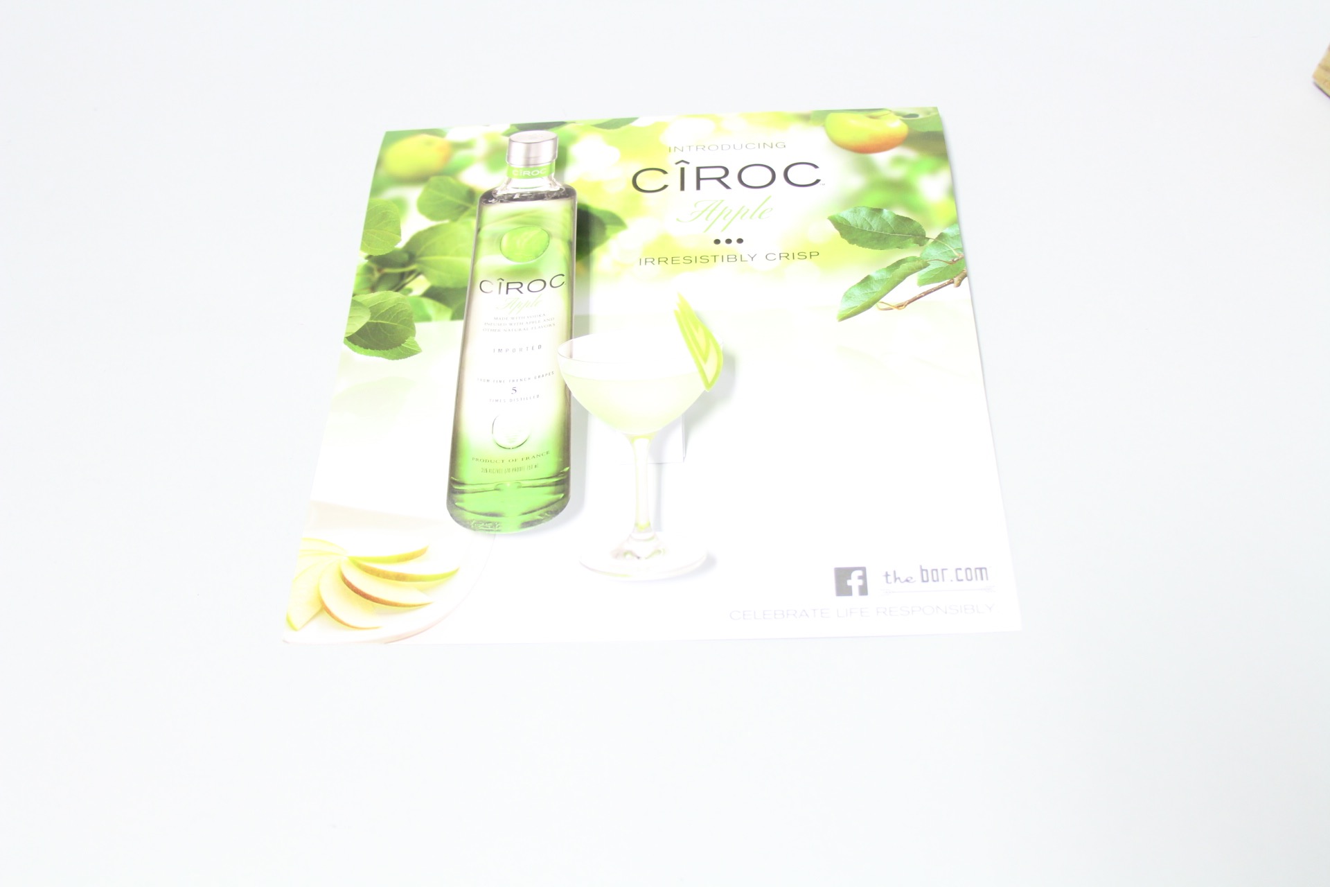
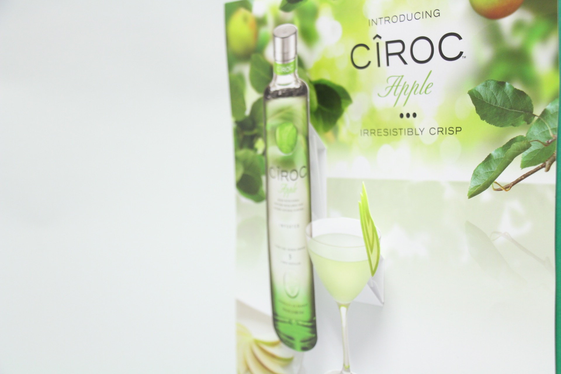
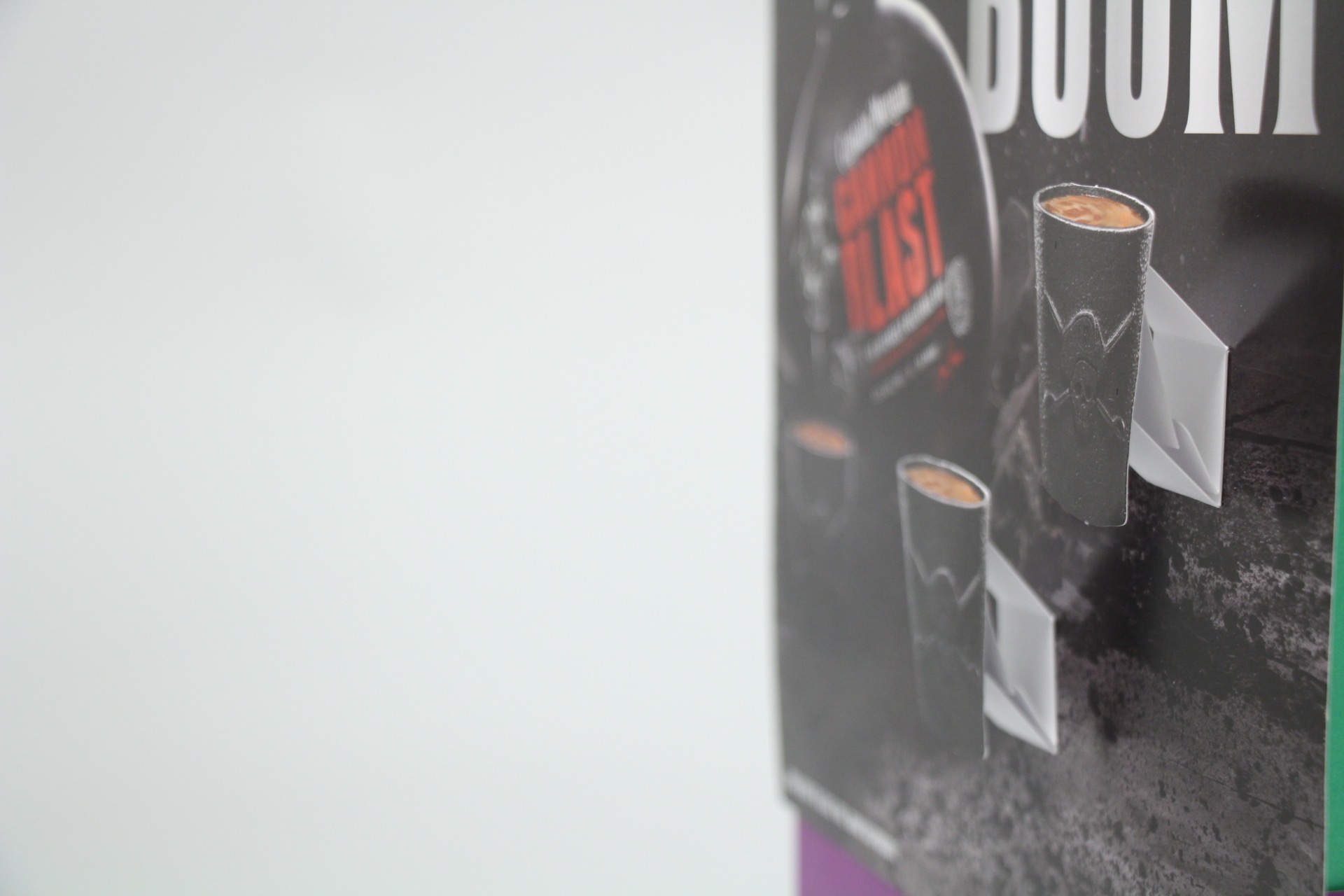
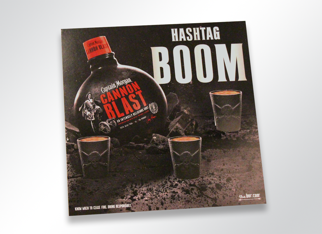
A Catchy #hashtag

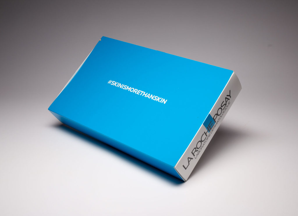
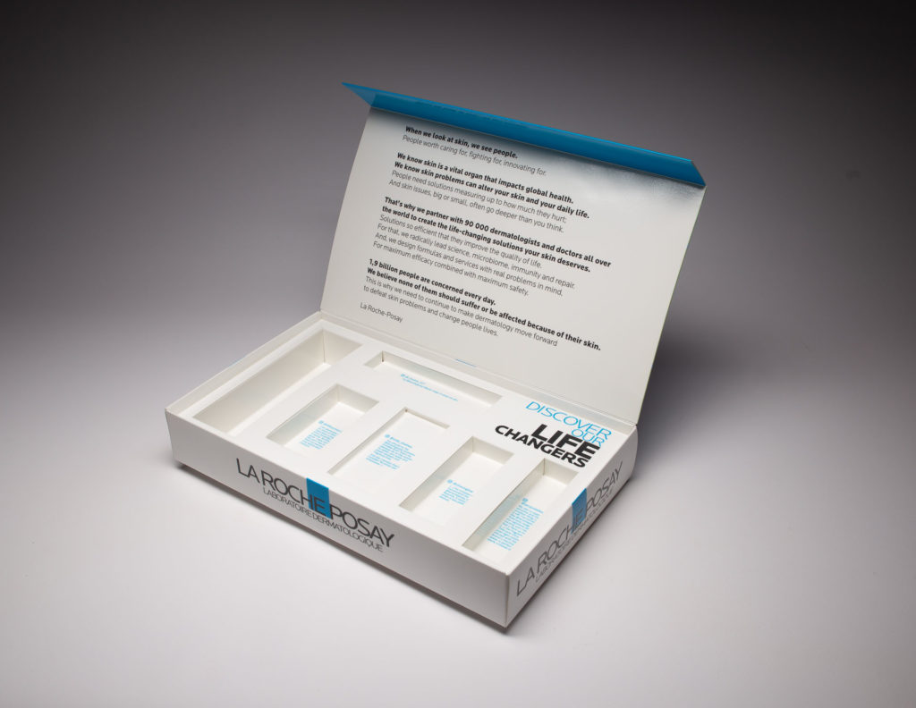
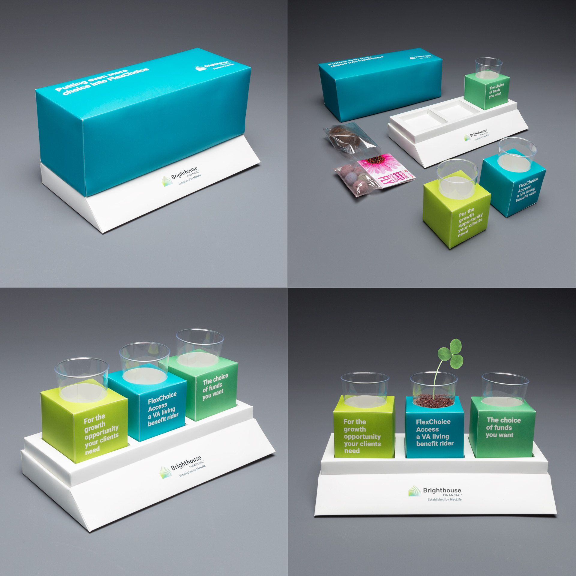
One way of encouraging recipients to talk about their unboxing experience is to pick a catchy and clever hashtag for your new product. Campaign-specific hashtags allow other consumers to join in on the conversation. We recommend prominently displaying it on the packaging itself. Here’s an example for La Roche-Posay.

La Roche-Posay is the number 1 dermocosmetic brand worldwide and they used this kit to send samples of its “life-changing” skincare line to key beauty influencers. The cover on the box featured La Roche-Posay’s #skinismorethanskin hashtag to encourage influencers to join in on the conversation. The inside of the kit held various samples of the product line with each in its own well. Posts from key influencers related to each product were featured behind each product. The lid also included internal magnets that allowed the lid to stay securely shut.

Go BIG

The biggest gift under the tree is the one most likely to generate the most excitement and get opened first. The same is true for packaging. 

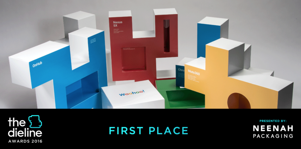
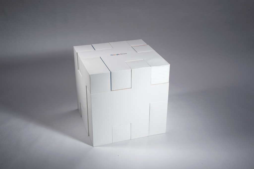
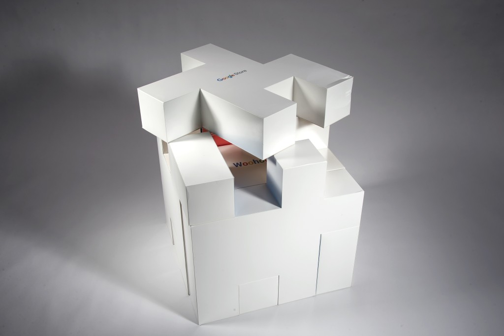
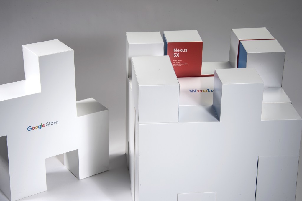
Years ago, our US strategic partners Structural Graphics, designed a launch kit for Google’s “Unboxing Event” which was used to promote their new store and products at the time. The boxes, which were designed like a puzzle with each piece carrying a different product, were sent to major influencers who then vlogged and posted videos of the box on YouTube. Google took it a step further by wrapping the box with branded gift wrap. 

The video currently has 4.6 million views. For comparison’s sake statistics show that almost 90% of video uploaded to YouTube generates fewer than 1,000 views.

You have to see it to believe it!

Add a Special Touch

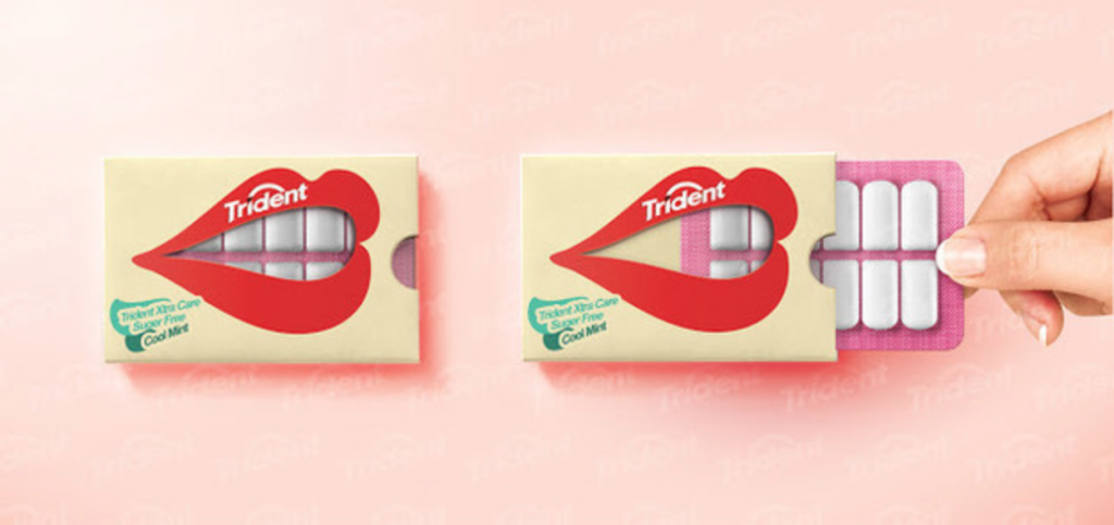
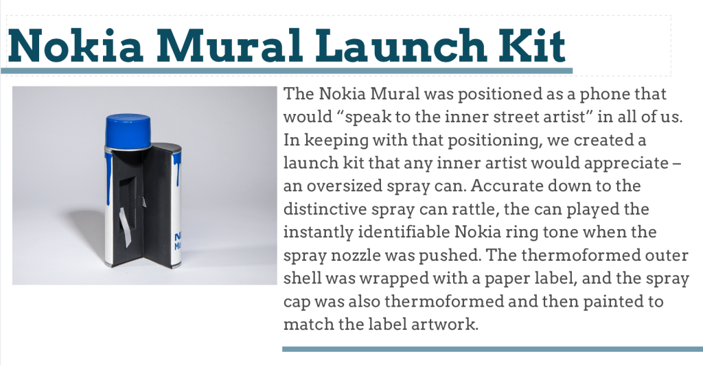
Wrapping paper, ribbon, tissue paper, decorative bows, branded stickers and unique packing material all add that special touch. Here’s an example for Nokia.

Nokia used this box to highlight the phone that was featured in the Dark Knight movie. They used lime green ribbon on the site to hold it all together. When you untie the ribbon, all sides of the purple box fall open and the Joker says, “Let’s put a smile on that face!” then laughs maniacally.

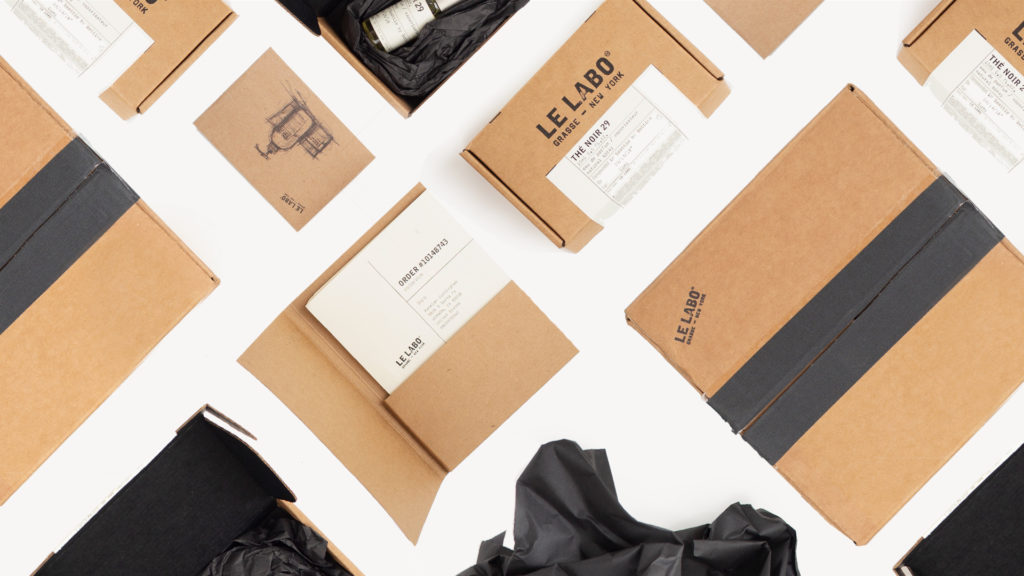
Fine fragrance brand Le Labo used black packing tape on the outside and black tissue paper on the inside for the special added touch and to tie it all together.

Build Anticipation

Having different components leading up the final reveal prolong the unboxing experience while building excitement. Kind of like having a box inside a box inside a box. It doesn’t have to be a series of boxes though. The different components inside could be made up of different materials, open in unique ways, unfold, expand and unwrap. Here’s how one company did it.

Roundel is Target’s modern media company. Their solutions find new ways to help brands connect with their perfect audiences. They used this incredible packaging to produce a unique unboxing experience designed to help drive brand sales. The center-split box opens to a tabbed panel that then lifts to reveal a booklet and a premium. The premium, Skullcandy earbuds, was wrapped in a promotional sleeve, while the booklet carried a QR code that launched “The Unboxing Moment” podcast.

Everything in Its Place

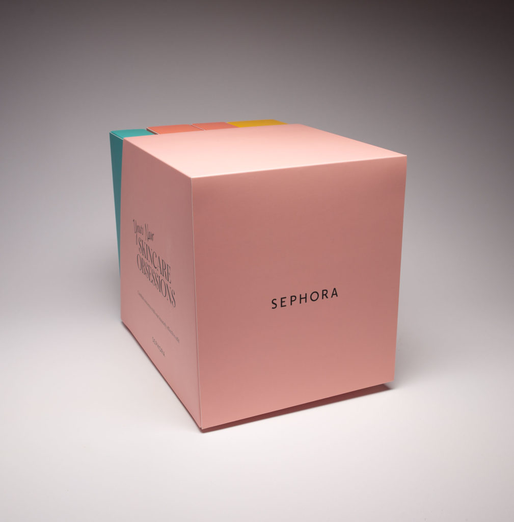
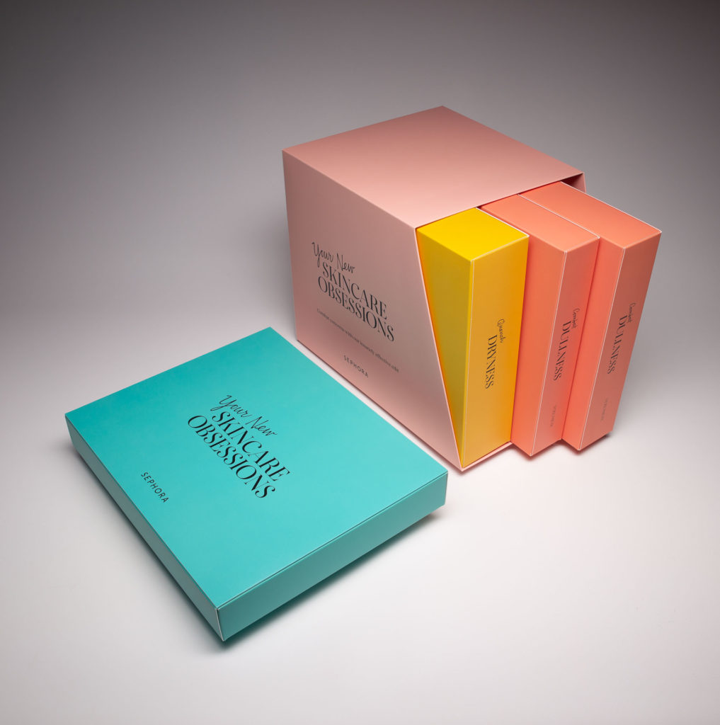
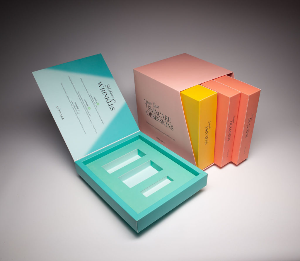
Organizing the contents of what’s inside the box is crucial especially if there are different products being highlighted within. This can be done by using individual boxes, sleeves to hold literature, miniature booklets or simply wrapping things individually. Here’s how Sephora did it. They used this promotional product kit to encourage influencers to unbox and learn more about their skincare solutions for dryness, dullness and wrinkles. The individual kits were contained in a slipcase for storage and easy access and dedicated to a different skin condition containing recommended product solutions. The design also allowed consumers to store and use it for future reference.

The Future of Unboxing

We believe unboxing is here to stay and that its future will continue to be bright. With so many unboxing videos competing with yours, standing out is paramount and so is upping the ante. Unique digital elements have made their way into the unboxing experience like Augmented Reality, Video and NFC tags. As with direct mail, brands are finding that bridging the gap between print and digital is instrumental in the success of the overall unboxing experience.

Structural Graphics & Sister Company, The Lift Factor, Take Home Top GDUSA Awards

Who designed the most innovative packaging of 2018? Graphic Design USA, the leading B2B resource for graphic design professionals, answered that question this month with the announcement of the winners of the 2019 GDUSA American Package Design Awards.

More than 1,000 marketers, designers and printers were challenged as never before to promote their brand in a way that would forge an emotional link with their customers. Out of those entrants, Structural Graphics took home two accolades: winner in the Luxury Packaging Category for Creata Kellogg’s Jurassic World Promotional Video Box and winner in the Food and Beverage Category for the GSD&M Popeyes Emotional Support Chicken Box.

Structural Graphics’ insurance marketing sister company, The Lift Factor, is also a winner in the Luxury Packaging Category for the Brighthouse Planter Mailer.

Think Outside the (In)Box: 5 Print Trends to Take Advantage Of

Where did January go?

As we continue to execute our 2019 marketing promotions and campaigns, there is no better time to revisit (and rethink!) your business’ print communications. Is your collateral giving people what they want? Does your team have clear priorities spelled out from the beginning?

If you answered “no” to either of these questions, keep reading for some tips on how you can ensure your brand communications aren’t missing any opportunities for business.

  1. Plan, plan plan. Is your warehouse overflowing with inventory? Or maybe you’re nervous to try dimensional print because of the barriers to entry? It helps to have a clear plan. By starting with the end in mind, you’ll be able to print only what your team needs, thus reducing inventory, waste and long-term costs.
  2. Get physical. Provide your customers with an immersive and interactive experience when they open your direct mail piece, invitation or campus flyer. More and more, the printing industry is getting increasingly creative with everything from packaging techniques to Virtual Reality. Use services like DX Print Group to delineate clearly the details of projects in your prints. Cut through the noise of overflowing inboxes and standard postcard mailers to not only capture your customers’ attention, but their hearts, too. 
  3. Don’t ignore the double dippers. These are the folks who receive both paper and digital communications. Statistically, many of these consumers are younger and, though they’re the most likely to go paperless eventually, are still open to the idea of receiving hard copies and snail mail. Take advantage of this market.
  4. Convenience is key. According to a poll by Keypoint Intelligence-Info Trends, customers said the best way for marketers to improve their print communications is to make them easier to understand. Instead of worrying about providing customers with every detail about your business, consider streamlining your marketing and focusing on one single “story” per piece. Not only does this cut out unnecessary detail, but it also makes your marketing easier to digest. Oh, and please, please remember to include a clear call to action.
  5. Prioritize, then execute. Perhaps a complete overhaul of your marketing strategy is in order, or maybe it just needs a fresh pair of eyes. Whatever the case, re-positioning your brand strategy allows businesses to start from scratch and execute on your priorities. How do you want customers to feel when they see your marketing communications? What action should they take after receiving it? These are all great questions to ask yourself and your team (if you’re not doing so already). They’ll encourage you to set clear goals for the year and inspire more detailed, thoughtful game plans to achieve them.

Popeyes is Offering Emotional Support (Chicken) this Holiday Season

A common topic of discussion in the news lately has surrounded the idea of allowing animals on airplanes to provide emotional support for travelers during the holiday season, as well as the restrictions for the types of animals that should be allowed. When GSD&M, Austin, TX had a buzz-worthy idea and design for a campaign for their client, Popeyes, to get holiday travelers talking (or should we say “squawking”) they contacted Blanks Printing, & Digital Solutions and the design and assembly teams at Structural Graphics to help bring this project to life!

The solution? “Emotional Support [Fried] Chicken”. For a limited time, those travelling in Terminal C of the Philadelphia Airport during the 2018 holiday season can now pick up the box which contains a 3-piece Chicken Tender combo meal from Popeyes.  Why the Philadelphia airport? Because it was named one of the most stressful airports in the United States.

“We know holiday travel can be frustrating, and there’s no better way to ease stress than with a box of delicious Popeyes fried chicken and a good laugh. We appreciate how comforting emotional support animals are and wanted to create our own version,” stated Popeyes CMO, Hope Diaz via news release.

The best part is, Popeyes is guaranteeing that their Emotional Support Chicken is “permitted to fly without any restrictions”, helping ease some of the worries for those crazed travelers this holiday season.

Blanks Printing & Digital Solutions, Dallas, TX printed this project on the new HP 12000 Digital press. Structural Graphics proudly engineered the design for function, created several rounds of full color test prototypes, and then hand assembled for the launch in the Philadelphia airport on Tuesday, December 18th.

Structural Graphics Video Mail Piece Grand Champion of 2017 US Postal Service Irresistible Mail Award

Some mail pieces are effective, some are engaging, some are beautiful. But very few can be called Irresistible Mail™” – the US Postal Service.

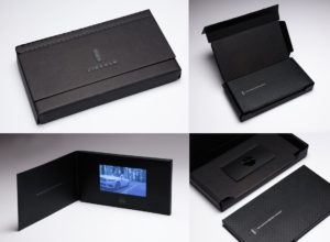
At the National Postal Forum in Baltimore, MD on May 23, 2017, The Lincoln Motor Company’s high-end video mailer, “See it First,” was selected as the Grand Champion Award winner of the “Irresistible Mail” trophy.  The Irresistible Mail Award is a USPS program that highlights mail pieces that increase engagement through innovative design, print or digital technologies.

Sharing creative credits on the winning mailer are Structural Graphics who printed and hand-assembled the piece, Lincoln Motor Company, Ford’s ad agency GTB (formerly Team Detroit), Hudson Rouge.

Used to give customers a sneak peek before the vehicle hit showrooms, this mailer presents a video screen embedded on the inside of a display folder.  Activating upon opening, the video delivers a story about Continental’s heritage and features, along with a tri-fold brochure describing the ownership experience, all delivered in a custom box. This piece was one of four finalists recognized at this year’s Forum, having been the winner of the 2nd quarter Irresistible Mail Award.

Additionally, you can find Structural Graphics on the 2017 USPS Irresistible site. Several of our pieces, created in partnership with MRM/ McCann and Sandy Alexander, are featured, including SleekPeeks VR Viewers, and OE, a slider design our paper engineers developed that features Near Field Communication and a “Twister” exploding page.

Be sure to check out Structural Graphics VPA Gallery.

PROJECT SPOTLIGHT: History Channel Sox Box

How many of you watch the History Channel?

We created this History Socks Box for A&E so they could showcase, in their words, “some of their best footage ever” with their ad sales clients. Each quarter, A&E chooses two of their hottest shows to highlight. In this case, it’s Join or Die with Craig Ferguson and Vikings.

This box is the first of its kind for the network and was designed to hold three pairs of socks – two inspired by that quarter’s featured shows and a third made up of spares. The box also includes an insert with show descriptions and scheduled airings.  

Interested in learning more about what went into creating this box? Head on over to our website or email us.

SG Takes Home Top Honors At The Dieline Awards 2016

Screen Shot 2016-05-19 at 3.29.08 PM


Who designed the most innovative packaging of 2015? The Dieline, the premier website on packaging design, answered that question at their annual conference held May 19-22. This year, The Dieline Package Design Awards received more than 1,200 entries from countries all over the world. Out of those entrants, Structural Graphics took home First Place in Technology, Media, Office and Self-Promotion for the Google Box.


The Box will be on display all week at HOW Design Live’s Exhibit Hall at The Dieline Awards’ exhibit booth.


g box1


“I could not be more proud of the entire team here at SG as well as at Blanks for their tireless efforts in bringing this project to life,” said Alex Bates, VP of Paper Engineering and Design. (For more from Alex, watch our acceptance speech video here.)


The Story of the Google Box:
g box 2
Last year, during the development of the Google Photos app pop-up book, we were asked through a string of emails whether or not we do boxes.


Psht. We practically invented them.


g box 3

So on September 16, 2015, we kicked off the project with a call to discuss concepts. Google wanted a packaging piece that could hold products that would promote its new store. Collaboratively, what we came up with was a box that fit together like a puzzle. Each of the “puzzle pieces” contained a different product Google was seeking to promote. The entire box was later sent to major influencers who then vlogged and posted videos of the box on YouTube.

Check out this video and this blog post we created for the full story.


The Dieline Awards are an international design competition recognizing the world’s best consumer product packaging design. Now in its 7th year, The Dieline Awards 2016 has gathered a highly esteemed jury of structural packaging, design, branding and consumer product experts. The Dieline Awards names its winners based on three vital design components: Creativity, Marketability and Innovation.

Packaging Unboxed: How to Make Your Product Stand Out (In A Good Way)

Hani Douaji / Via behance.net

The old adage goes something like this: Don’t judge a book by its cover.
Except when it comes to packaging, that is.
Though packaging been around for generations, in today’s digital-savvy, uber competitive retail environment, first impressions are almost as important as the product itself, with innovative, fun, or even weird packaging helping a product to stand out from its competitors. At times, the way an item looks can actually make or break a sale.
Let me tell you a personal story…
Lots of you have probably heard about or even seen those small, egg-shaped EOS lip balms (yup, those ones). Well, I was recently talking with a girlfriend of mine who pulled one out of her purse and started using it despite the fact that she liked some other brands of lip balms better. So, why did she buy this one? Because it looked cute.
Maybe you’ve experienced this, too? Bueller…? Bueller…?

Isabella de Felice / Via lushlee.com

Whether it’s an edgy typeface that gets your customers, some cool pops of color or the versatility of an eco-friendly container, we’ve probably all had a moment like my friend here where we’ve purchased something simply because of the way it looks and, more importantly, for our perceptions of how a product will make us feel. (Here’s an example of how the psychology of packaging applies in the alcohol industry).

That’s the whole point.
Packaging, when done correctly, is ultimately what sells your product in the end. It draws attention, sends a powerful message and elicits a specific response from your customers.
Here’s an example of a packaging design we created for Nokia:
Nokia Mural Launch Kit

Packaging Infographic Marketers
So, what’s a marketer to do to stand out from the crowd?
Well, if you’re a devout believer in creating a branded experience for your customers, making your product relevant and increasing your sales, follow these five Packaging Commandments and you just might create product packaging that will outlive us all.
  1. Thou shalt embrace all manners of colors, patterns, textures and sizes.
  2. Thou shalt never forget to think about the customer’s experience.
  3. Thou shalt utilize all available space to the best of thou’s ability.
  4. Thou shalt be playful, be bold, be simplistic – Thou shalt stay true to him/ herself.
  5. Thou shalt always tell a good, compelling and powerful story.
Feeling insanely creative? Give us a call at 860-767-2661 or shoot us an email. Together we can make your packaging really pop.

Drink Me: Marketing in the Alcohol Industry

A few tips (on the house).

“Marketing” is a broad term that embodies a wide range of activities and disciplines that promote and sell a product. It casts a wide net that is open to interpretation; and when you throw alcohol into the equation, well things can get a little crazy.

(Wait, what happened last night?)

Cheers!

First thing’s first. When you are marketing in the alcoholic beverage industry, the same basic marketing rules still apply.

Your 4 P’s: Product, Price, Place, Promotion

So, how exactly do these relate to alcohol beverage marketing? Let’s break it down.

Product

At the risk of stereotyping, there are certain alcohols that appeal to a younger crowd that do not appeal to older folk, and vice versa. My dad loves his tried and true Tito’s (really, Tito’s, my dad is your biggest fan – going on 10 years strong which is some serious brand loyalty).  I, on the other hand, the millennial in all of my glory, am more likely to try something different simply because the packaging catches my eye.

It’s no secret that our generations shop differently: my dad has been going to the same mechanic for years, whereas I go wherever the deepest discount is, or wherever the most convenient location is.

A study in Australia determined that adolescents were more likely to gravitate towards ‘alcopops’, a.k.a. booze-y drinks that have very little actual booze in them – malt beverages, wine coolers, etc. – because the packaging is designed to look like a soft drink.

Colorful-Cans

Price

Everyone loves a good discount. It is common knowledge that if we will get a discount on buying more, we will buy more (see Sam’s Club, Costco, etc.) whether we really need it or not. And not to much surprise, when we buy more, we consume more. Shots, shots, shots shots, shots, shots, shots shots…

Price discounts and promotions can have a huge impact on volume of alcohol purchases. They can be a key marketing tool for producers and retailers.

A study conducted by Alcohol Focus Scotland found that supermarket promotions and discounts on alcohol increased sales by 20 – 25%. 

Place

Location, location, location. Anyone who has ever been in a liquor store knows that those places can get pretty crowded. So many brands are trying to promote their products on the shelves or even at the register, so it can be hard to stand out and get the consumer to pay attention and make them want to buy. Did you know that companies pay top dollar for prime shelf space in the stores?

But once you have that spot, how do you stand out among the rest of the bottles of the shelves surrounding it?

Diageo was wondering the same thing, so their agency came to us looking for new ideas of how they could boost sales in stores. This was the first time they have ever done anything like this – and viola, they were so successful, that they have already placed their second order!

Ciroc Case Tucker
Diageo/Marketing Agency & Structural Graphics // Ciroc Case Tucker

How exactly do they work? These case tuckers were tucked in between the shelves in between the bottles, promoting and drawing attention to their products.

Case Tuckers5
Diageo/Marketing Agency & Structural Graphics // Ciroc Case Tucker

Case tuckers are a unique way to sell your customer directly while they are shopping, begging for customers attention. These most certainly trump the Sharpie and neon signs you see on every shelf promoting cheap liquor and practically screaming, “DON’T DRINK ME.”

Case Tuckers3


2415-1266-captainmorgan-popup

Promotion

Alcohol promotions are everywhere. Sponsorships, advertisements,  commercials, events, the list goes on. Increasingly, alcohol is being promoted more and more via social media.

Do you need to promote your liquor brand, or unveil a new one? A truly exciting and creative way to do so is to host a PR event. And that’s exactly what Bacardi Brands did with when they came to Structural Graphics to create their Dewar’s Influencer Kit!

See below.

CRAIGELLACHI1_resized

CRAIGELLACHI2_resized

CRAIGELLACHIE7_resized

The Marketing Arm came to us to develop and design this beautiful Dewar’s influencer kit. The kit was for a PR event unveiling two new brands, Craigellechie and Aberfeldy, and showcases each in a storybook format appropriately titled “The Tale of Two Whiskies”.

To read more about this super cool launch, click here!


It’s no secret that no matter what you’re promoting, you need a way to stand out amongst the crowd. Need to reach your audience? Give yourself some height by adding a little dimension to your brand.